
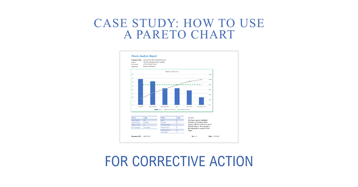
Corrective Actions Should Begin with Data, Not Assumptions
When quality issues occur repeatedly, the immediate response is often to investigate the most recent failure. While this may resolve an isolated event, it does not always address the defects having the greatest impact on quality, cost, or customer satisfaction.
A Pareto chart provides a structured method for prioritizing corrective action efforts by identifying which defect categories occur most frequently. Rather than distributing resources across every issue equally, organizations can focus on the relatively small number of causes responsible for the majority of nonconformities.
What Is a Pareto Chart?
A Pareto chart is a graphical quality tool that combines:
- A bar chart displaying defect frequency
- A cumulative percentage line
- An 80% threshold used to identify high-priority defect categories
Based on the Pareto Principle, often called the 80/20 rule, the chart helps identify the relatively few defect types contributing to most quality problems.
Instead of asking, “What failed?” the Pareto chart answers:
- Which defects occur most often?
- Which defects should be addressed first?
- Where will corrective action provide the greatest benefit?
Corrective Action Case Study: Scratches on a Rotor Hub Assembly
An aerospace manufacturer recorded 128 nonconformances during production. Pareto analysis showed scratches accounted for 34 occurrences, making them the highest-priority defect. A Fishbone analysis identified inadequate handling methods and worn fixtures as contributing factors. After implementing revised handling procedures, replacing fixtures, and retraining operators, scratches decreased to 9 occurrences during the following reporting period.
Step 1: Collect Defect Data
Begin by reviewing nonconformance reports, inspection records, customer complaints, or production quality data.
Typical manufacturing defect categories may include:
- Burrs
- Scratches
- Missing Welds
- Material Defects
- Tool Marks
- Wrong Revision
- Surface Damage
- Dimensional Nonconformance
Record the number of occurrences for each category over a defined period.
Step 2: Organize Defects by Frequency
Arrange each defect category from the highest occurrence to the lowest.
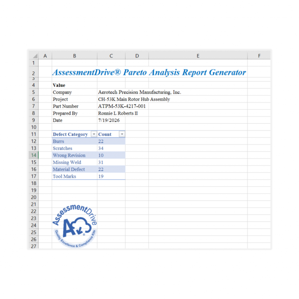
For example:
| Defect | Count |
|---|---|
| Scratches | 34 |
| Missing Weld | 31 |
| Burrs | 22 |
| Material Defect | 22 |
| Tool Marks | 19 |
| Wrong Revision | 10 |
Sorting the data reveals which issues have the greatest impact before any investigation begins.
Step 3: Create the Pareto Chart
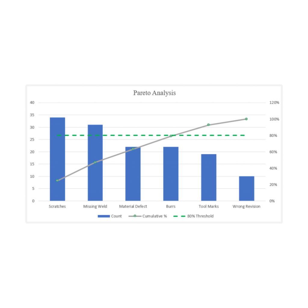
The Pareto chart displays:
- Individual defect counts as bars
- Running cumulative percentage as a line
- The 80% threshold indicating where most quality issues originate
Frequently, only two or three defect categories account for most recorded nonconformities.
This prevents teams from spending equal effort on low-impact issues while significant recurring problems remain unresolved.
Step 4: Select the Highest-Priority Defect
The purpose of the Pareto chart is not to identify root cause.
Its purpose is to determine which problem deserves investigation first.
For example, if scratches account for the highest number of defects, corrective action should begin with scratches before investigating less frequent issues.
This creates an objective, risk-based approach to corrective action planning.
Step 5: Perform Root Cause Analysis
Once the highest-priority defect has been identified, deeper analysis begins.
Common tools include:
- Fishbone (Cause-and-Effect) Diagram
- 5 Whys Analysis
- Process Mapping
- Failure Mode and Effects Analysis (FMEA)
The Pareto chart identifies what should be investigated.
Root cause analysis identifies why it occurred.
Fishbone (Cause-and-Effect) Diagram
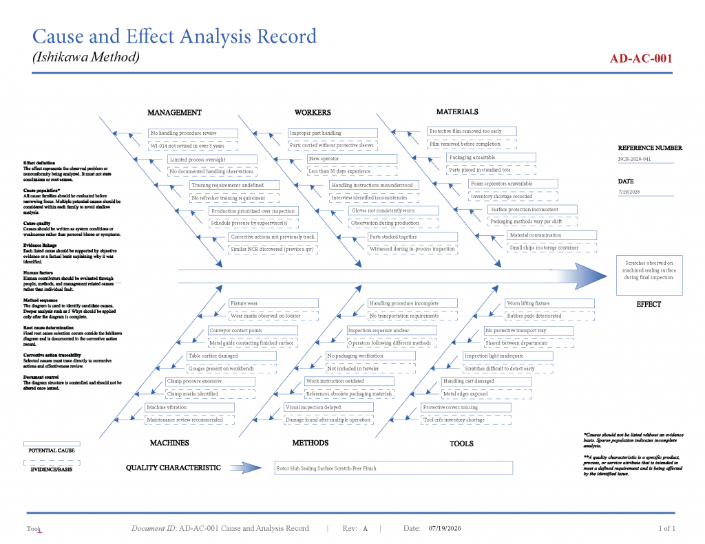
A Fishbone analysis was completed to evaluate potential causes of recurring surface scratches. Possible contributing factors were identified within Management, Workers, Materials, Machines, Methods, and Tools. The investigation identified deficiencies in handling methods, documentation, equipment condition, and process controls, which were further evaluated through a structured 5 Whys analysis to determine the validated root cause.
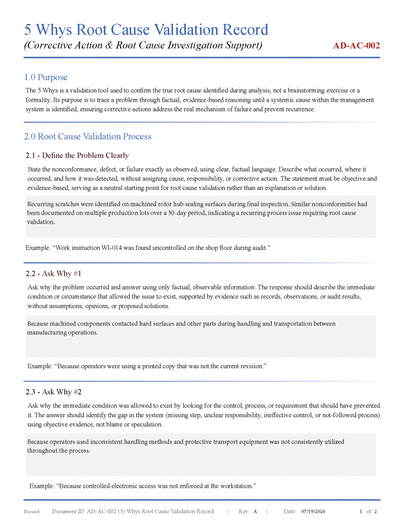
5 Whys Analysis
The 5 Whys Root Cause Validation Record documents the structured investigation used to confirm the validated root cause of a nonconformity through objective, evidence-based questioning. Beginning with the observed problem, each successive “why” examines the process, controls, and management system to identify the underlying mechanism that allowed the issue to occur. The analysis concludes when the verified root cause is supported by objective evidence and provides the foundation for developing effective corrective actions intended to prevent recurrence, rather than simply correcting the immediate condition.
Step 6: Implement Corrective Action
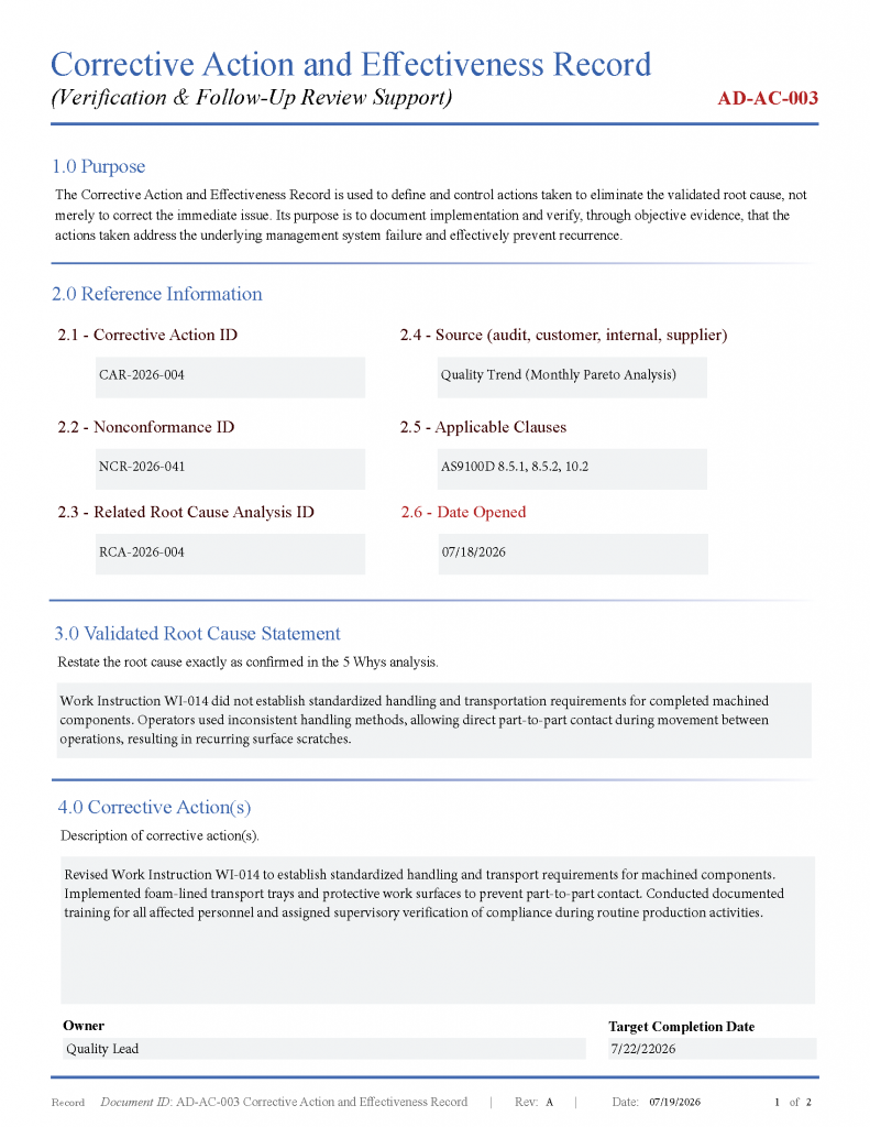
After confirming the root cause, corrective actions may include:
- Revising work instructions
- Updating inspection criteria
- Improving operator training
- Replacing worn tooling
- Improving supplier controls
- Modifying process parameters
- Strengthening verification activities
Corrective actions should eliminate the cause of the nonconformity rather than simply correcting the individual defect.
Step 7: Verify Effectiveness
Corrective action is not complete until effectiveness has been verified.
Continue collecting defect data after implementation and generate a new Pareto chart.
If the targeted defect category decreases significantly, the corrective action has demonstrated measurable improvement.
If the same defect continues to dominate the chart, additional investigation may be required.
Why Pareto Analysis Improves Corrective Action
Using a Pareto chart before beginning root cause analysis provides several advantages:
- Prioritizes improvement efforts using objective data
- Focuses resources on the highest-impact quality issues
- Supports risk-based decision making
- Reduces recurring defects
- Strengthens continual improvement initiatives
- Provides documented evidence for audits
- Improves corrective action effectiveness
Rather than relying on assumptions or anecdotal evidence, organizations can demonstrate that corrective action priorities were established using measurable quality data.
AssessmentDrive® Pareto Analysis Tools
AssessmentDrive® provides professionally developed Pareto analysis tools designed to support corrective action investigations and continual improvement activities. These resources help quality professionals organize defect data, automatically generate Pareto charts, identify high-priority defect categories, and document analysis using structured, audit-ready reports.
How to use a Pareto chart for corrective action? Whether supporting AS9100, ISO 9001, or internal quality initiatives, Pareto analysis provides a practical first step toward identifying the defects that warrant immediate corrective action.
Frequently Asked Questions
Is a Pareto chart required for corrective action?
No. Quality standards generally require organizations to determine the causes of nonconformities and implement effective corrective actions, but they do not mandate the use of a Pareto chart. It is widely recognized as a best practice for prioritizing improvement efforts.
What is the difference between a Pareto chart and a Fishbone Diagram?
A Pareto chart identifies which defect categories occur most frequently. A Fishbone Diagram investigates the potential causes of a selected defect.
When should a Pareto chart be used?
Pareto analysis is useful whenever organizations need to prioritize recurring defects, customer complaints, inspection findings, warranty issues, supplier problems, or production nonconformities.
Does a Pareto chart identify the root cause?
No. It identifies the highest-priority problem. Root cause analysis is performed afterward using tools such as Fishbone Diagrams or the 5 Whys.