
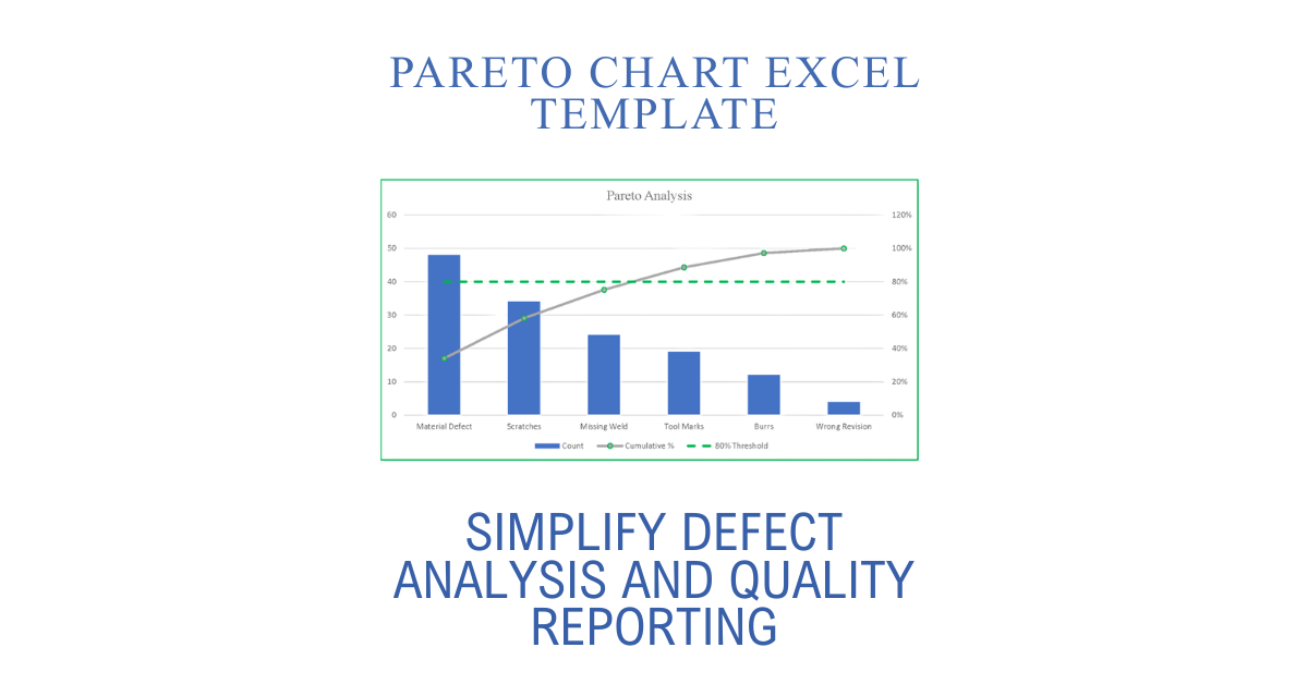
When quality teams need to identify the issues causing the greatest impact, speed and consistency matter. A Pareto chart Excel template helps transform raw defect data into meaningful insights, allowing organizations to focus improvement efforts where they will produce the greatest results.
Whether you’re supporting an AS9100 quality management system, maintaining ISO 9001 compliance, or driving Lean and Six Sigma initiatives, a well-designed Pareto analysis workbook can eliminate manual calculations while producing professional reports in minutes.
What Is a Pareto Chart?
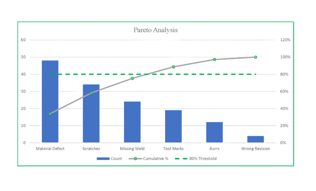
A Pareto chart is a visual quality improvement tool based on the 80/20 principle. It ranks categories from the highest to lowest occurrence while displaying a cumulative percentage line. This makes it easy to identify the small number of defect types responsible for the majority of problems.
Instead of treating every issue equally, teams can prioritize corrective actions where they will have the greatest impact.
Why Use a Pareto Chart Excel Template?
Many organizations still build Pareto charts manually every time new inspection data becomes available. This process is repetitive, time-consuming, and often leads to inconsistent formatting or calculation errors.
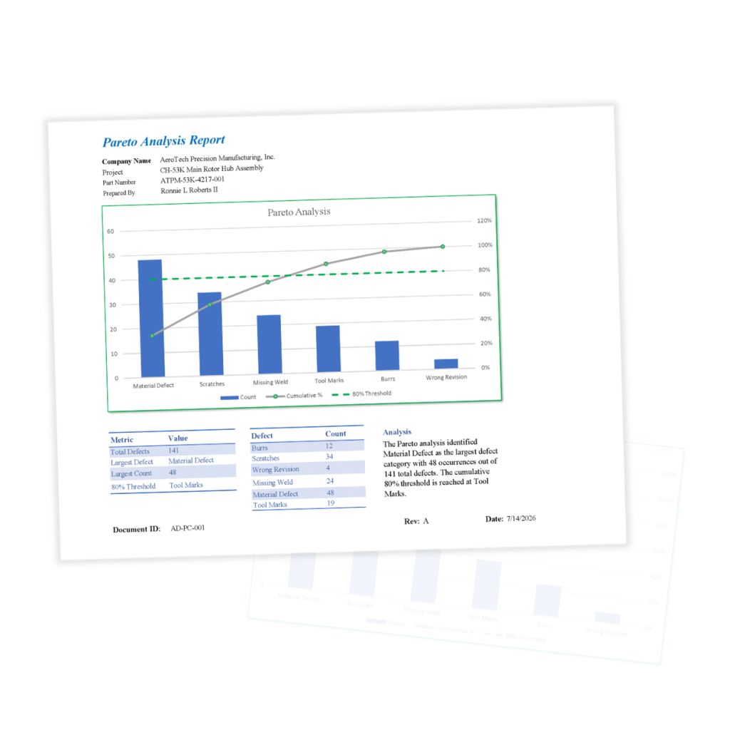
A professional Pareto chart Excel template automates the entire process by calculating percentages, sorting defect categories, generating cumulative totals, and producing presentation-ready reports.
Benefits include:
- Reduce time spent creating Pareto charts
- Standardize quality reporting
- Eliminate manual calculations
- Improve management presentations
- Prioritize corrective actions
- Support data-driven decision making
Common Applications
Pareto analysis is widely used across manufacturing and quality management environments, including:
- Aerospace manufacturing
- Defense contractors
- Machine shops
- Production facilities
- Supplier quality
- Receiving inspection
- Internal audits
- Corrective actions
- Continuous improvement projects
- Lean Six Sigma initiatives
Because the methodology applies to virtually any measurable process, Pareto charts can also be used for customer complaints, downtime events, warranty claims, service issues, and administrative process improvements.
Features to Look For
Not all templates provide the same level of functionality.
A professional workbook should include:
- Automatic defect sorting
- Percentage and cumulative calculations
- Customizable defect categories
- Executive summary reporting
- One-click PDF generation
- Protected calculations
- Guided data entry
- Sample data for quick setup
These features allow users to focus on analyzing results instead of formatting spreadsheets.
Why Excel Remains the Preferred Platform
Microsoft Excel remains one of the most widely used business applications in manufacturing. Organizations already have trained personnel, existing workflows, and compatibility with inspection and quality reporting processes.
Using an Excel-based Pareto analysis tool avoids the expense and learning curve associated with specialized statistical software while delivering the reporting capabilities most quality professionals require.
Improve Quality Decisions Faster
Finding the largest contributors to defects should not require hours of spreadsheet work. A purpose-built Pareto chart Excel template automates calculations, standardizes reporting, and produces professional results suitable for management reviews, corrective actions, customer reporting, and continuous improvement initiatives.
By reducing administrative effort, quality teams can spend more time solving problems instead of building charts.